

Why mobile first layouts beat desktop designs for trade businesses

Why mobile first layouts beat desktop designs for trade businesses
A lot of business owners assume a website only needs to look polished when viewed on a desktop computer at their kitchen table. They spend weeks choosing colour palettes and comparing portfolio galleries, only to find the phone hardly rings any more often than before. The truth is usually far less glamorous. Most customers browse for urgent trades or services while standing in a driveway, waiting for a bus, or dealing with an unexpected breakdown. They do not have the patience to pinch and zoom through a slideshow, and they certainly do not want to tap a tiny link that fails to load properly.
This gap between desktop perfection and mobile reality is worth addressing immediately before investing further time into visual design. A beautifully rendered page means very little if it cannot be used instantly by someone holding a phone in one hand. The focus needs to shift entirely towards how a site behaves when the user is on the move, under pressure, and actively looking for help. Understanding mobile-first layouts for trades changes the entire conversation about what actually drives enquiries and builds lasting credibility.

Why mobile first layouts beat desktop designs for trade businesses
The modern customer rarely sits down with a laptop to find a plumber or electrician. They are usually standing in a cold kitchen with a leaking pipe, or waiting outside their clinic after an unexpected delay. In these moments, they need immediate answers, clear pricing expectations, and a straightforward way to book a call. If the primary interface assumes the user is comfortable and stationary, the site fails its first real-world test entirely.
Mobile-first layouts for trades mean designing for the smallest screen and the shortest attention span before considering anything else. This approach forces a strict prioritisation of essential information. Contact details move straight to the top. Service lists strip away decorative text and fluff. Buttons become large enough to be hit without frustration. When you build this way, desktop visitors also benefit from a cleaner, more direct experience because the core message remains uncluttered by unnecessary elements. A responsive site simply shrinks a desktop view to fit a screen. A mobile-first layout proves that the essential information works perfectly on a phone before expanding outwards for larger displays.

Loading Speeds Matter More Than Heavy Images
It is very common to see agencies loading a site with high-resolution images and animated sliders. These elements look impressive on a broadband connection in an office, but they become the single biggest reason for bounce rates when viewed on a mobile 4G signal that fluctuates between streets or inside a stone building. A trade website must load almost instantly. Every extra second of wait time loses potential customers who are trying to solve a problem right now. This means compressing images correctly, minifying code, and avoiding heavy background videos that consume data unnecessarily.
Google’s own PageSpeed Insights documentation explains exactly how performance metrics impact user retention across different network conditions. Additionally, Google Chrome support pages offer practical steps for testing load times and identifying blocking resources. If a customer has to wait for a portfolio piece to render, they will simply check the next result in the search list rather than waiting around.
Navigation That Makes Sense With One Thumb
Traditional websites often rely on complex drop-down menus that require precise mouse movements. On a touch screen, those delicate interactions are frustrating and prone to errors. A well-structured trade site uses a simplified navigation hierarchy that requires only one hand to operate comfortably. Critical links should appear within easy reach of the thumb’s natural resting position. Instead of hiding service details under multiple layers, the most important information sits immediately after the homepage.
This reduces the number of taps required to reach an enquiry form or view pricing guidelines. Smooth scrolling and clear section breaks also help a visitor scan content rapidly without feeling lost. When navigation is frictionless, the customer stays focused on solving their problem rather than fighting the interface.
Why A Fast Mobile Site Builds Trust Faster Than A Portfolio Gallery
A portfolio gallery full of before-and-after photos sounds appealing on paper, but it often slows down the core purpose of the website. Customers visiting a trade site are usually in a problem-solving mindset. They want to know if you can help them, what it costs roughly, and how quickly you can arrive. Visual proof is useful, but it rarely outweighs immediate reliability. A streamlined mobile experience communicates respect for the customer’s time. It signals that the business understands modern expectations and prioritises clear communication over decorative flair. When a site loads instantly, displays text clearly in bright sunlight or dim lighting, and responds accurately to taps, it builds credibility before a single phone call is made.
Putting The Enquiry Form Where It Actually Gets Used
Many business owners place contact forms deep inside their site or hide them behind generic “About Us” links. This design choice ignores basic human behaviour during a service request. A visitor who has found a relevant trade page is looking for a direct route to speak to someone. They will not click through three extra screens to find the phone number. Placing a contact form at the very top of mobile pages, or keeping it fixed at the bottom of the screen as they scroll, dramatically increases submission rates. The form itself should ask only for the essentials: name, phone number, and a brief description of the job. Every additional field is a chance for an impatient user to abandon the process. Keeping this pathway clear and uncluttered ensures that interest converts into a conversation without unnecessary delays.
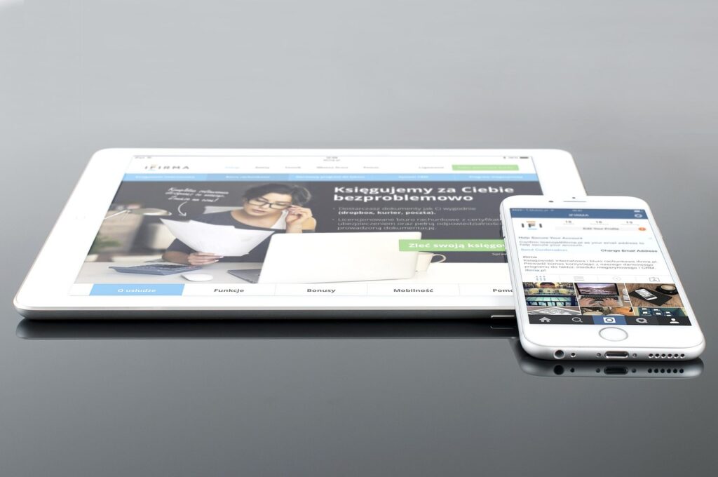
Moving the focus from desktop aesthetics to mobile functionality is not just a technical adjustment; it is a fundamental shift in how local businesses interact with urgent customer requests. By designing for fast load times, simplified navigation, and one-handed usability, a trade website becomes a genuine asset rather than a digital brochure that gathers dust. These practical improvements align perfectly with the real-world conditions under which services are actually booked.
If you would like to explore how your current setup handles these everyday browsing scenarios, our team at Revive can review your site’s performance and suggest targeted tweaks to improve customer journeys and increase enquiry volumes across all devices.
Ready to Transform Your Marketing?
Let us help you implement these strategies and build an automated marketing system that drives real results for your business.
Get Started Today